Selected Work

Google Android

Designing for a Global Audience. Strategy and delivery of the Android Design System, shaping future design standards and enhancing user engagement.

Client
Google Android
Services
Design Systems, Design Operations, UX/UI Design, Accessibility, Agile
Role
Head of Design
Team
3 x Product Designers, 6 x Engineers, Product Manager, Delivery Manager
Awards

Android faced growing challenges across its ecosystem: inconsistent visual language, duplicated components, technical debt, and fragmented collaboration between internal and external teams. We partnered with Google to define, design, and implement a modern, scalable design system that unified the platform's experience and enabled design and engineering teams to work more efficiently.

Project Goals

  • Align visual language across all Android Developer properties.
  • Create a reusable component library to improve design and dev velocity.
  • Implement accessibility and usability standards consistently.
  • Reduce product complexity and technical debt.
  • Establish governance and documentation to support long-term scalability.
Google Android
Google Android
Phase 1

Systems Discovery

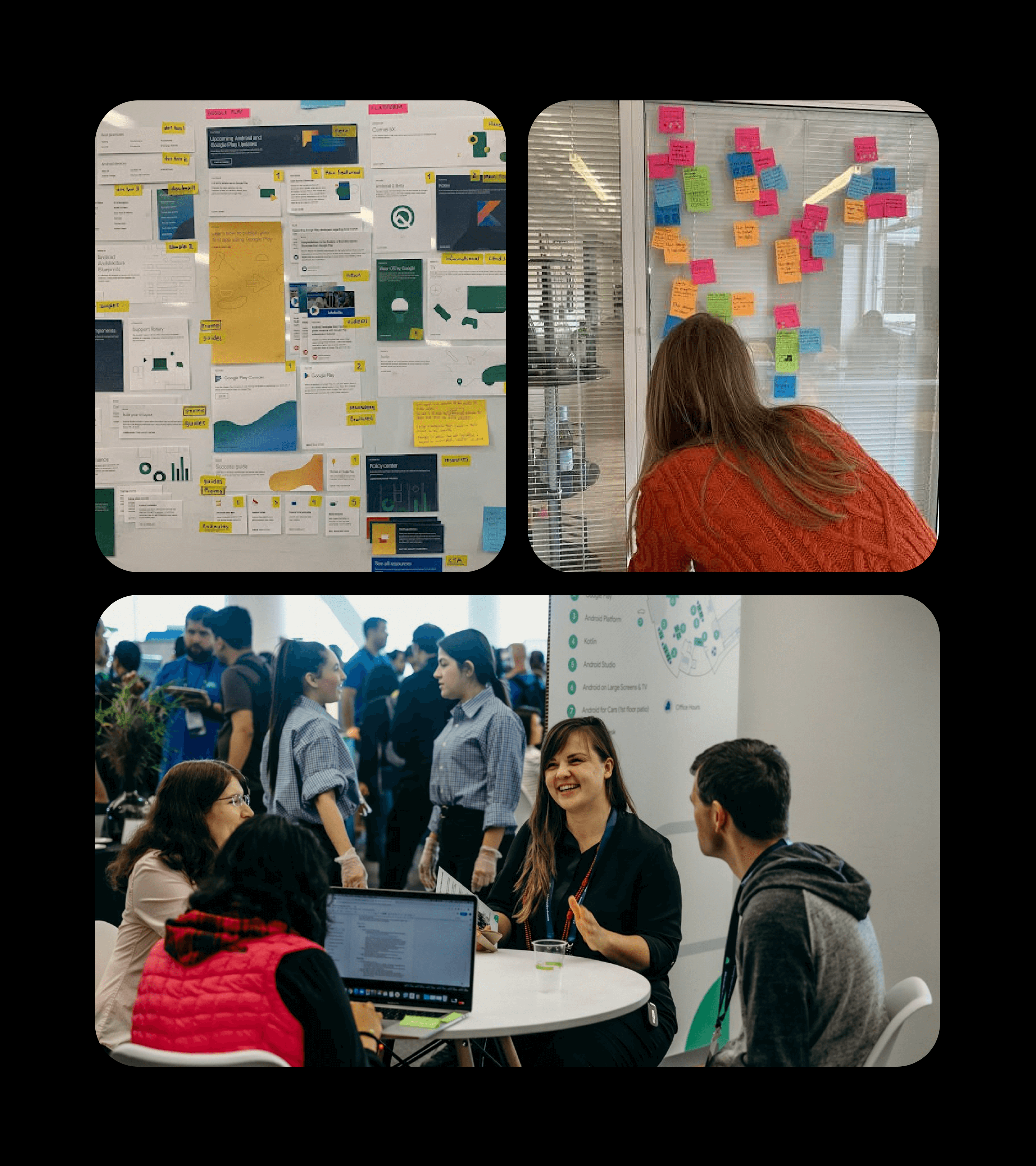
We started with a series of collaborative workshops and audits to understand the platform's complexity and user needs. This helped us shape the system's core intent and define the most impactful opportunities.

  • Design System Audit: We reviewed all Android Developer surfaces and identified key inconsistencies in components, layout systems, and interaction styles.
  • Stakeholder Workshops: We co-created a shared vision and success criteria with Google stakeholders.
  • Design System Principles: Together we defined principles that would guide decisions, including Consistency not uniformity, Design with purpose, and Make it modular.
  • Pain Point Mapping: Common issues such as duplicated components, disconnected tooling, and visual inconsistency were mapped and prioritized.
Google Android
Google Android
Phase 2

Systems Foundation

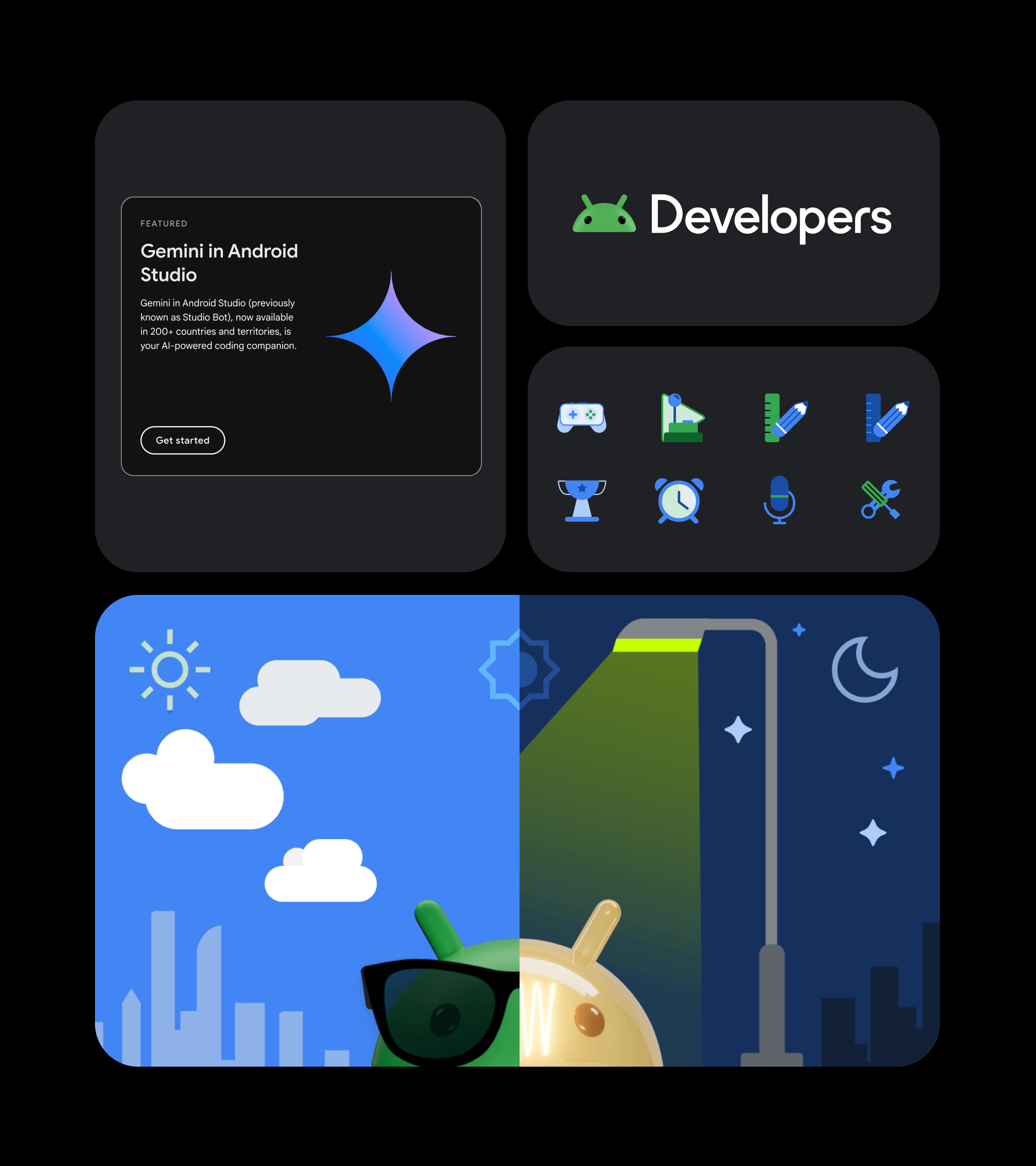
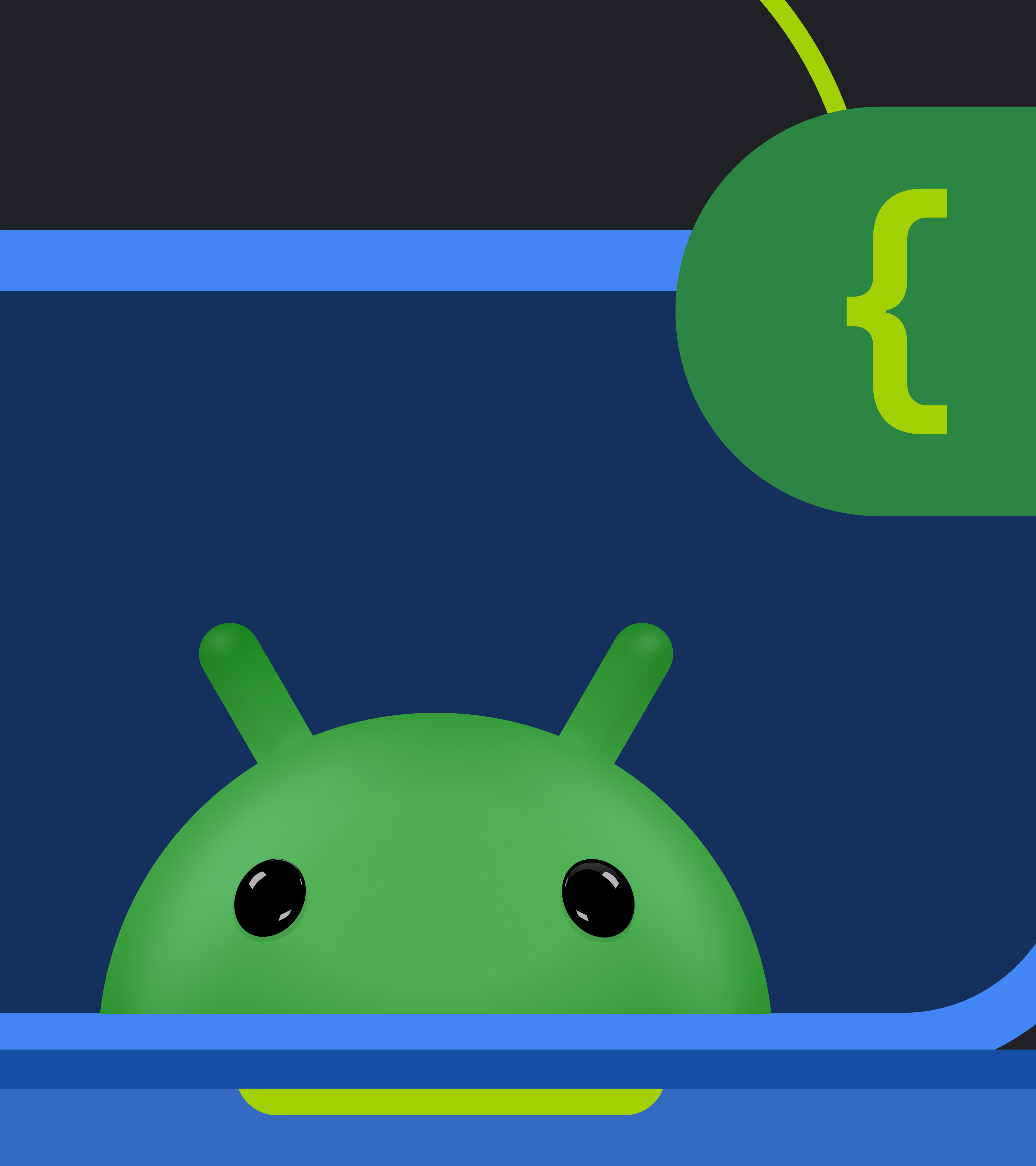
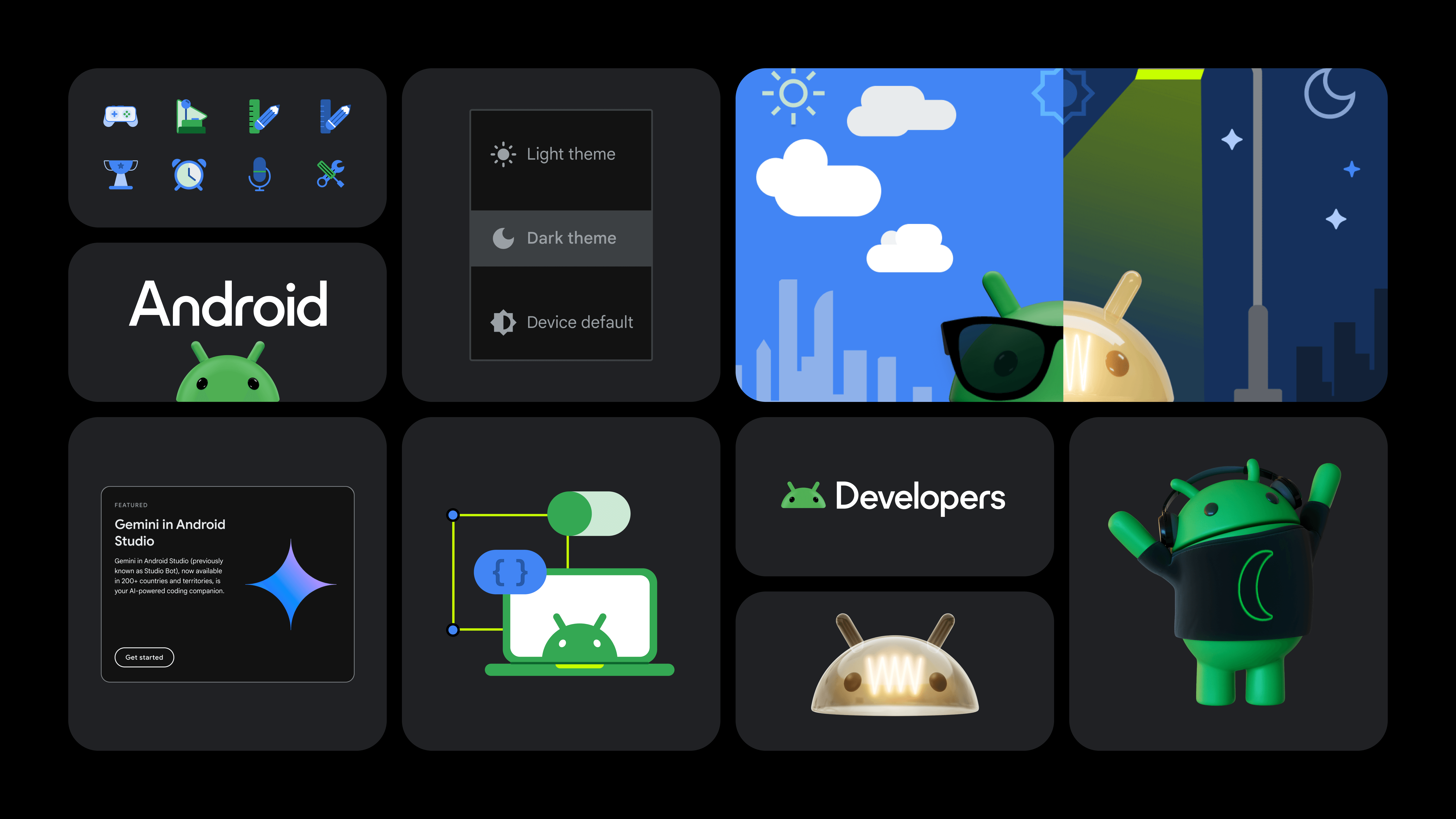
We began this phase by exploring multiple creative directions. Through collaborative concepting sessions and critique forums, we examined how different visual approaches could express the Android brand across developer tools. We considered tone, energy, clarity, and scalability in each route. Once a creative direction was chosen, it served as the north star—guiding the visual tone and grounding decisions throughout the project.

  • Concepting & Creative Direction: We explored multiple visual routes collaboratively before aligning on a final creative direction that reflected Android’s tone, energy, and purpose.
  • Visual Language: We defined typography, colour palettes, grid systems, spacing rules, and iconography.
  • Component Tokens: To promote consistency and flexibility, we established design tokens for spacing, elevation, and breakpoints.
  • Design Kit Setup: A modular Figma design kit was created, making it easy for teams to build UI quickly with consistent, system-based elements.
Google Android
Google Android
Phase 3

Component Design & Validation

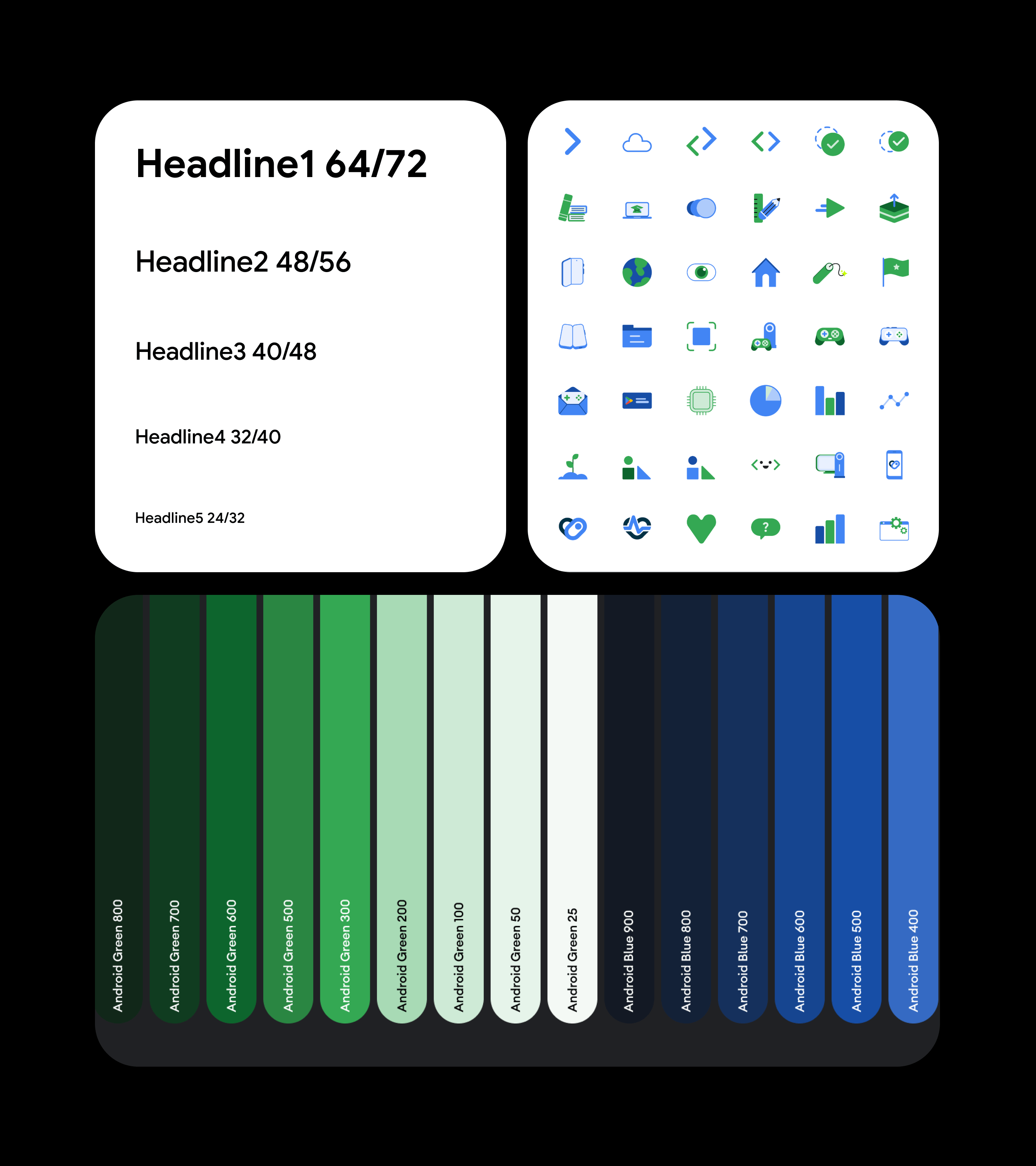
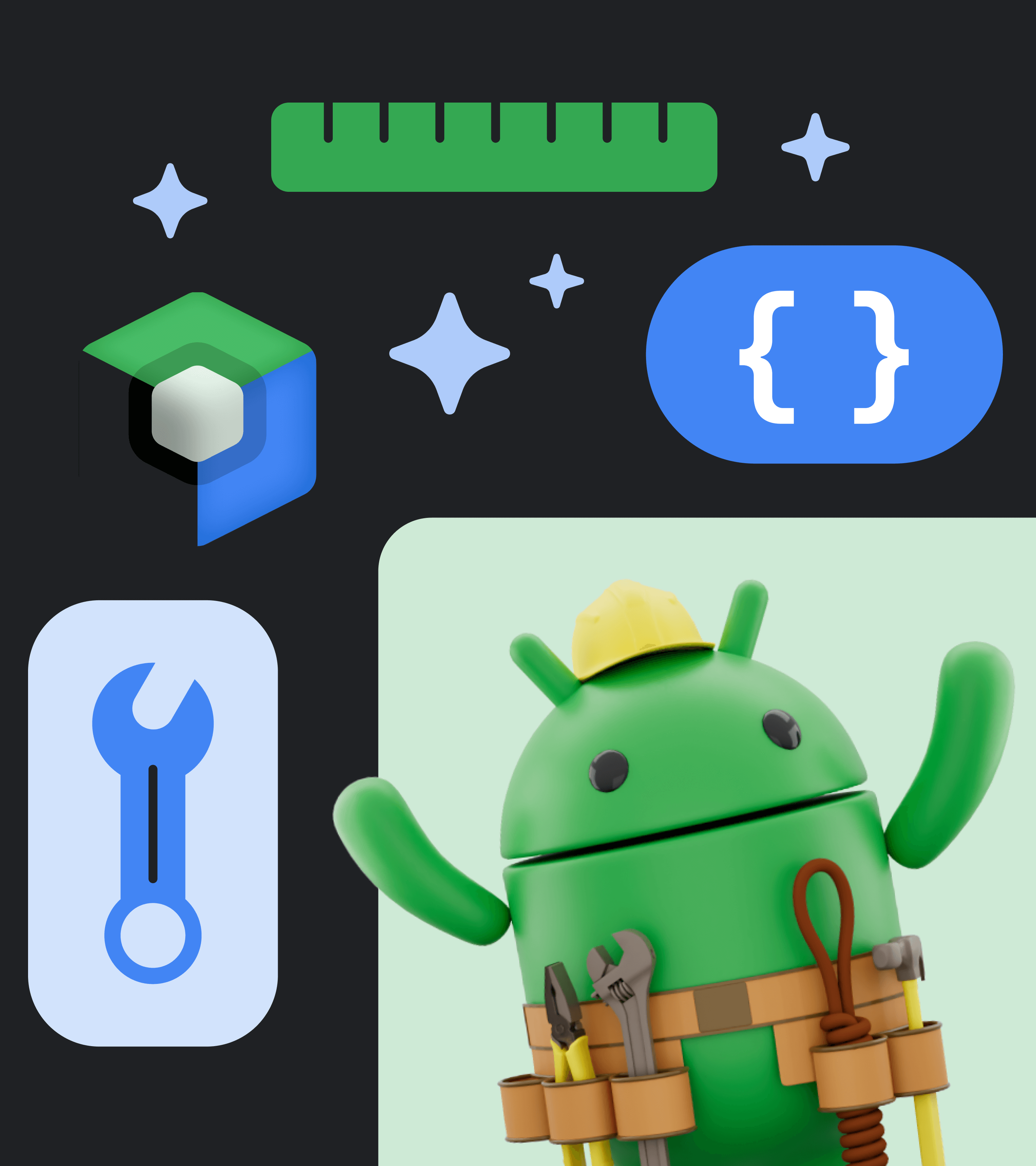
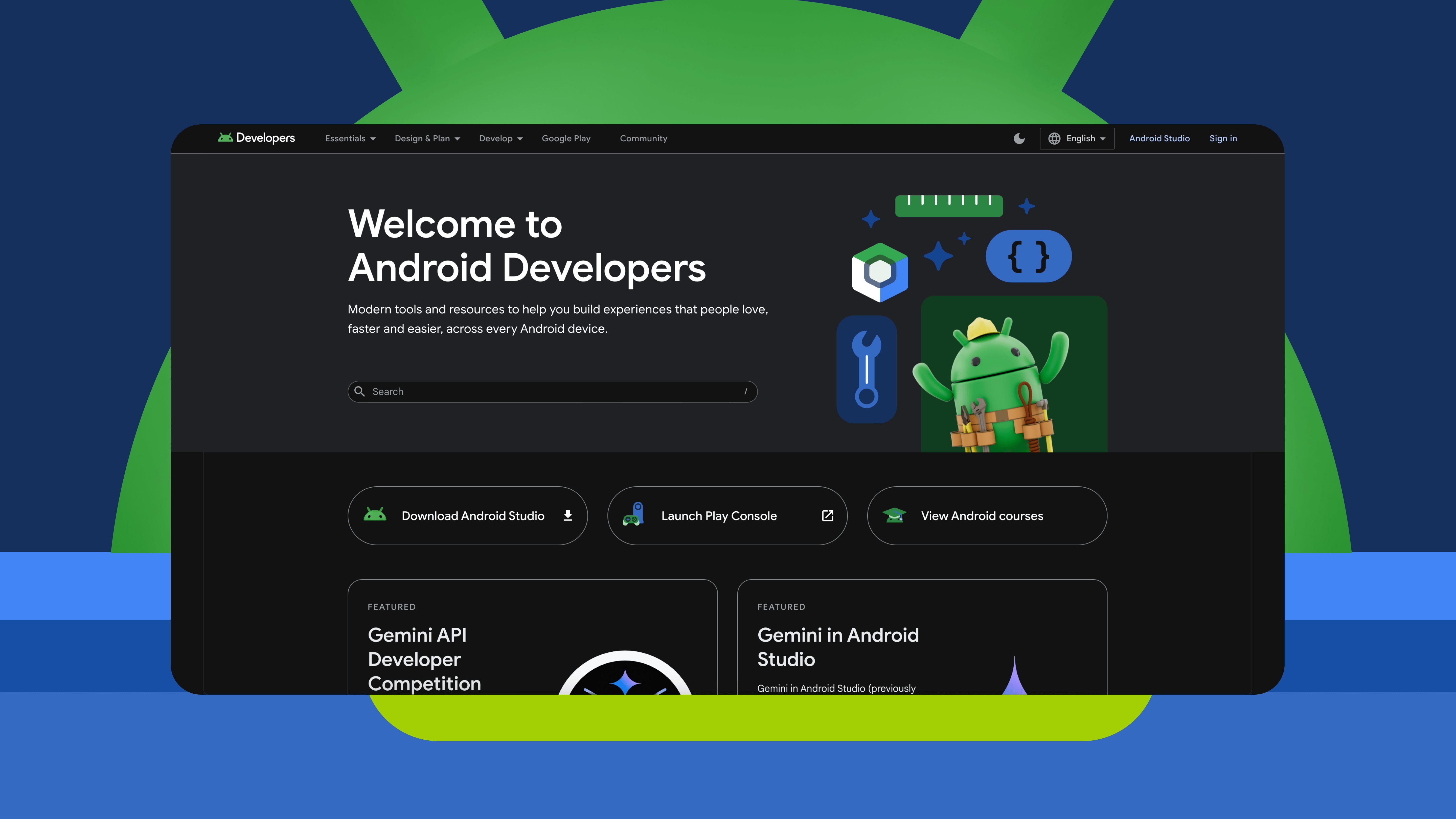
With the visual system and design kit established, our focus shifted to translating these into functional UI components. This phase was all about designing components that balanced consistency and flexibility, then validating their usability through prototyping and stakeholder input.

  • Component Library: Buttons, cards, filter chips, nav elements, inputs and other components were designed with accessibility baked in.
  • Prototyping: We created sample flows using early components to validate functionality and cohesion.
  • Accessibility Testing: We reviewed components for keyboard accessibility, contrast compliance, and responsive behaviour with a diverse pool of over 35 candidates.
  • Design Crit Reviews: A recurring forum brought stakeholders together to align on interaction behaviours and edge cases.
  • Usage & Rationale Documentation: Component usage guidelines and edge case considerations were written alongside the design work.
Google Android
Google Android
Phase 4

Implementation & Rollout

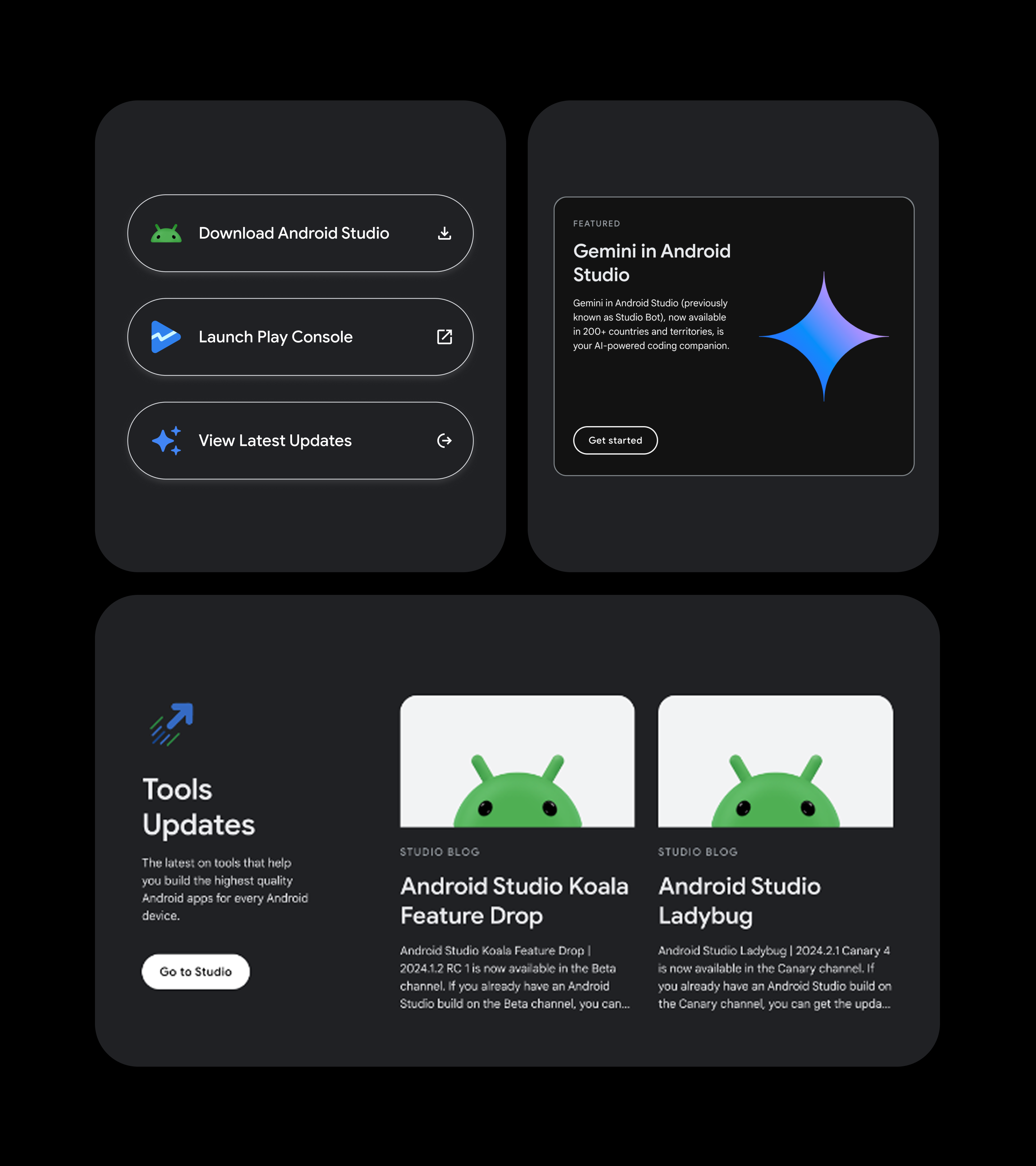
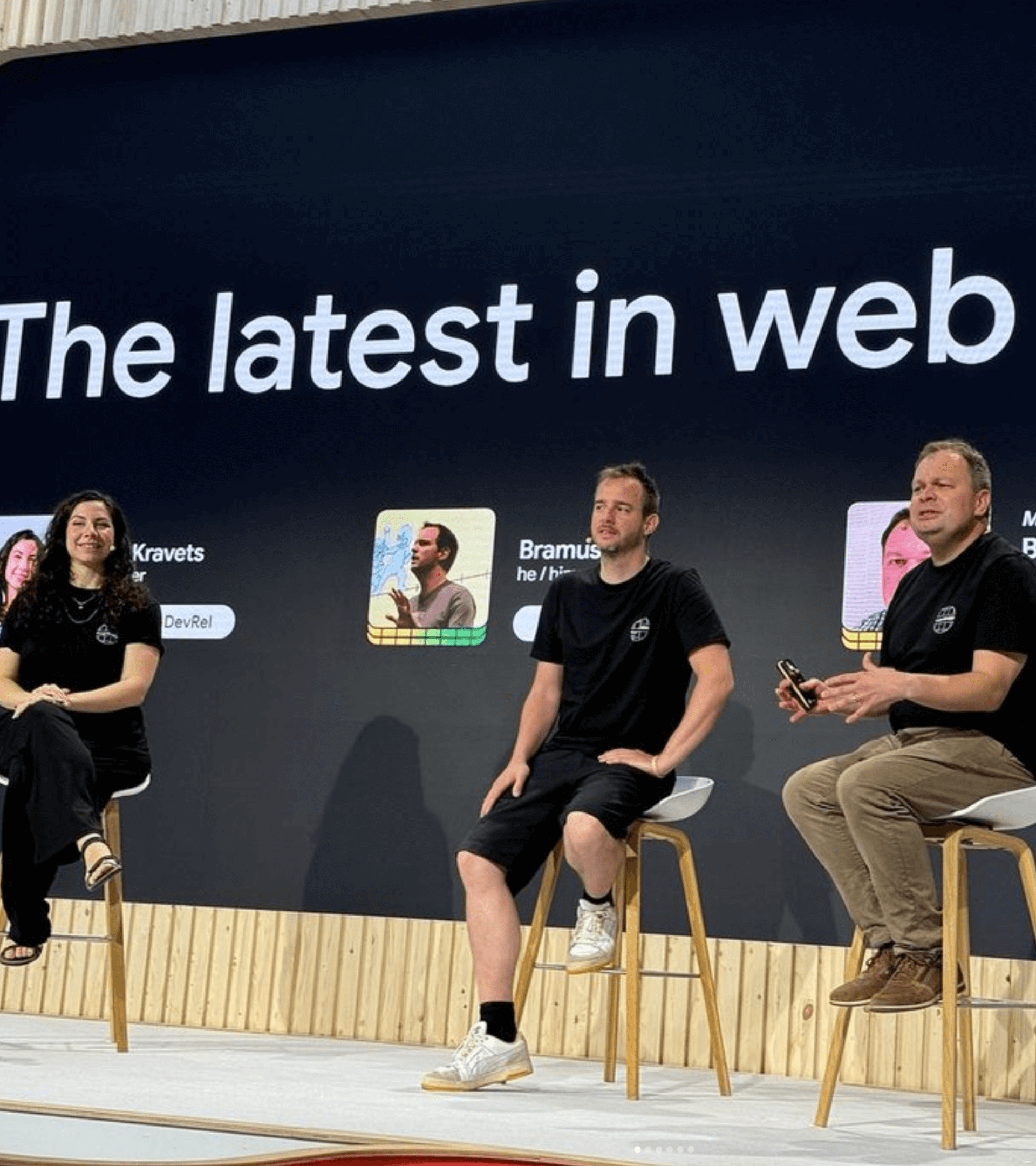
With validated components in place, we moved into implementation, ensuring the system was usable in real-world product environments. This phase focused on technical integration, accessibility assurance, and supporting widespread adoption across teams.We worked closely with Android engineering teams to embed the system into production.

  • Parallel Dev/Design Workstreams: Our Figma library was mirrored in a developer-accessible codebase using Android’s tech stack.
  • Team Enablement: We ran demos and created onboarding docs to help other teams adopt the system.
  • Usage Playbooks: We outlined common implementation scenarios and anti-patterns to support correct usage.
Phase 5

Governance & Scaling

To future-proof the system, we established a clear governance structure and operational model. This ensured new requests, improvements, and documentation could evolve without compromising integrity or consistency, supporting ongoing system health and growth.To ensure the system would evolve effectively, we embedded a governance structure into the wider workflow.

  • Governance Roles: We established a clear split between Makers (design leads, tech leads, system owners) and Users (designers, devs, tech writers).
  • Design Ops Workflows: New design requests flowed through a review cycle: brief → proposal → critique → implementation → documentation.
  • Figma and Code Sync: Changes were reflected in both design and dev libraries, with release notes published at each update.
  • System Culture: Beyond tooling, we introduced rituals like "Component of the Month" and regular show-and-tells to keep momentum and foster a sense of ownership.
IMPACT

One visual language across all developer-facing surfaces. Teams could work faster using documented, tested components. Built-in standards ensured inclusive design from the start. Eliminated redundancy and modernised underlying architecture. A foundation for expansion into future Android product verticals.

Final thoughts

The Android Design System has become a foundational tool for Google’s developer ecosystem, transforming how teams build consistent, accessible, and efficient digital experiences. It has improved workflows, reduced complexity, and elevated the quality of user experiences across one of the world’s most widely used digital platforms.

Explore My Work

Looking to dive deeper into my projects? Check out my Works Page to explore case studies on the impactful design solutions I’ve created across industries.

See my selected projects
ArrowArrow